Your rebrand looks perfect on a calibrated monitor. Then the first 2,000 polos arrive, and the "trustworthy blue" reads as "cheap denim" under conference hall lighting.
Color psychology in branding defines how customers perceive value, trust, and competence before they read a single word. But in the world of corporate apparel, this is not just an artistic choice. It is a strict supply chain challenge.
We manage sourcing for complex global merchandise campaigns, and we see the same mistake repeatedly. Companies perfect their brand identity design digitally but fail to account for how dye reacts to different fabric types, print methods, and lighting conditions.
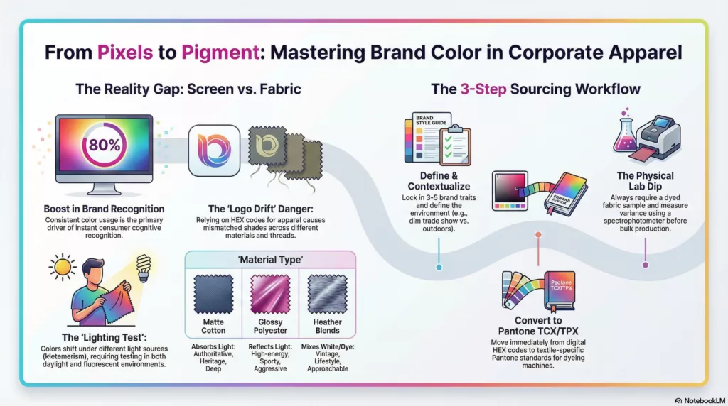
Research from the University of Loyola Maryland indicates color increases brand recognition by 80%. However, that recognition relies on absolute consistency. If your "moving billboards"—your employees and event staff—wear mismatched or faded shades, it signals operational incompetence rather than cohesion.
This article connects the emotional influence of consumer behavior and color to a visual identity strategy that survives manufacturing. We will explain exactly how to mitigate the risks of choosing brand colors for physical goods and bulk orders.
Apparel requires tight color control and supplier coordination. Get a quote for color-matched corporate apparel here.
What is Color Psychology in Branding?
Color psychology in branding is the study of how color choices influence human perception and behavior. For brand managers, color acts as a pre-verbal signal. It tells the customer whether a brand is "competent," "rugged," or "sophisticated" before they read a single word of copy.
Think of color like the background music in a retail store. You might not consciously listen to it, but it dictates the mood—calm and expensive, or loud and urgent.
What It Is Not
We often have to correct the myth that color is a magic "buy button."
- No Universal Rules: Red does not guarantee hunger, and Green does not automatically mean "sustainable." Cultural context changes everything (e.g., White represents purity in the West but mourning in parts of Asia).
- Not a Substitute: The perfect shade of "Trustworthy Blue" cannot fix a product with poor build quality.
The Vocabulary of Perception
To source effective merchandise, you must move beyond basic color names. Here is how professionals define the terms:
- Hue: The color family (e.g., Blue, Red, Yellow).
- Saturation: The intensity of the color. High saturation feels bold but can look "cheap" in mass quantities; low saturation often feels premium.
- Value: The brightness. Darker values (Navy) signal authority; lighter values (Sky Blue) signal approachability.
The Apparel Reality
This is where standard definitions fail. In digital marketing, a hex code is absolute. In our line of work, material alters psychology. Texture, lighting, and fabric absorption change how a color is received. A "high-energy orange" on a retina display often looks like a generic "safety vest" when printed on polyester.
Research Insight: In their study "Exciting Red and Competent Blue," researchers Labrecque & Milne validated that saturation primarily influences perceived excitement, while value (brightness) drives perceived ruggedness and competence. Source:Journal of the Academy of Marketing Science
💡 Key Insight: Don't just pick a color; pick a*saturation level. A highly saturated logo works on a tech gadget but may look aggressive on a corporate uniform.*
3. Core Concepts: The Engineering of Perception
We treat color not as an artistic choice, but as a data transmission problem. In branding, color functions as the operating system of the consumer’s mind. It executes a rapid sequence of decoding—long before the customer reads a company name or touches a product.
However, a psychological trigger is useless if it cannot be reproduced physically. The challenge lies in aligning the Cognitive Pathway (how the brain reacts) with the Manufacturing Reality (how ink and dye behave). Here is the mechanism, from the neural signal to the factory floor.
3.1 The Psychological Pathway (Stimulus → Action)
The brain processes visual data 60,000 times faster than text. This process follows a strict linear sequence:
- The Stimulus (Input): Light reflects off an object and hits the retina. The optic nerve transmits this signal to the visual cortex.
- The Association (Processing): The limbic system—the brain's emotional center—cross-references the color against a library of learned memories and cultural norms. (e.g., "Neon Yellow" = "Caution/Industrial.")
- The Outcome (Output): The brain releases neurochemicals that dictate behavior. This creates immediate visceral reactions: Trust (low heart rate), Urgency (heightened alertness), or Appetite.
🧠 Expert Insight: Brands fail when they ignore the*context of this pathway. A bright red button on a website signals "Action." That same bright red on a corporate blazer signals "Aggression" or "Dominance," which may kill a deal in a B2B meeting.*
3.2 Brand Identity Design: The Personality Algorithm
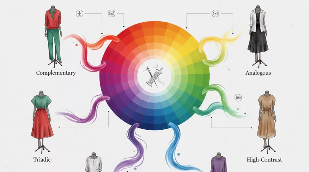
Color creates a personality system when paired with shape and typography. We view this as a formula: Color + Geometry = Archetype.
- The Competence Formula: Navy Blue + Serif Fonts + Sharp Angles = "Reliable/Traditional."
- The Innovation Formula: Electric Purple + Sans-Serif Fonts + Rounded Corners = "Tech/Disruptive."
To build a palette, we do not guess. We follow a logic chain:
- Brand Adjective (e.g., "Secure") $\rightarrow$ Desired Neuro-response (Calm) $\rightarrow$ Spectral Choice (Low-saturation Blue) $\rightarrow$ A/B Testing.
3.3 Category Norms vs. Differentiation
Every industry has a "wavelength standard." Banks utilize blue to leverage the psychological cue for stability. Fast food chains utilize red and yellow to trigger hunger and turnover speed.
This creates a strategic tension: Conformity vs. Disruption.
- Conformity: Using the category color (e.g., Green for Eco-products) reduces cognitive load. The customer instantly knows what you sell.
- Disruption: Choosing a contrasting color (e.g., Liquid Death’s black/gold for water) forces the brain to re-categorize the product. This is high-risk but high-reward.
3.4 Color Palette Meanings (The Industrial Map)
Context alters meaning, but these are the baseline industrial associations we use for initial sourcing:
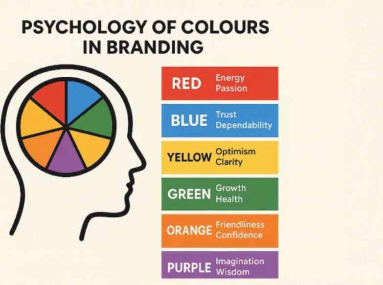
- Blue: Intelligence, stability, duty. Risk: Coldness or lack of emotion.
- Red: Energy, passion, danger. Risk: Aggression or warning signals.
- Green: Growth, finance, nature. Risk: Stagnation or envy.
- Yellow: Optimism, clarity. Risk: Anxiety or perceived cheapness.
- Black: Sophistication, luxury, authority. Risk: Mourning or heaviness.
- White: Hygiene, purity, efficiency. Risk: Sterility or emptiness.
3.5 Apparel-Specific: The Production Ladder
This is where the theoretical meets the physical. A screen emits light (RGB), while fabric absorbs light (CMYK/Pantone). A neon green that vibrates on an iPhone screen will often look muddy when dyed into cotton.
To ensure Brand Consistency across our custom promotional clothing, we force a conversion process:
- Digital Concept: Designers work in HEX / sRGB.
- Print Assets: Files convert to CMYK for paper marketing.
- Textile Master: You must select a Pantone TCX/TPX code. This is the only language a dyeing machine understands.
- The Lab Dip: The factory produces a small swatch of dyed fabric.
- Spectrophotometer Check: We measure the "Delta-E" (distance between colors). If the variance is $>1.0$, we reject the batch.
3.6 Material-Color Synergy
The substrate (material) changes the physics of the color. We see this daily in our apparel manufacturing methods:
- Matte Cotton: Absorbs light. Navy Blue appears deep, heritage-focused, and authoritative.
- Glossy Polyester: Reflects light. That same Navy Blue appears brighter, sportier, and more aggressive.
- Heather Blends: White threads mix with the dye. This physically lowers saturation, automatically signaling "Vintage" or "Lifestyle."
The Perception Gap: A "Luxury" brand logo printed on shiny, cheap nylon destroys the perception of quality, even if the Pantone code is accurate. The texture contradicts the color.
3.7 Before/After Analysis: Mechanics in Action
- Case 1: The Trust Shift (Fintech)
- Before: Bright "Start-up" Lime Green. Signal: Risky, volatile, new.
- After: Deep Forest Green + Slate Grey. Signal: Established, wealthy, grounded.
- Result: Increased enterprise demo requests by signaling institutional maturity.
- Case 2: The Energy Pivot (Retail)
- Before: Monotone Black/White. Signal: Generic, severe.
- After: Added "Signal Orange" accents to staff uniforms. Signal: High energy, approachable assistance.
- Result: Improved customer service interaction rates on the floor.
Key Benefits: Why Visual Strategy is a P &L Issue
Most marketers treat color as an aesthetic preference. We treat it as a performance metric. When you scale from a digital logo to 5,000 branded uniforms, color psychology stops being "art" and becomes revenue engineering.
Boosts Brand Recognition by 80%
Color offers an instant cognitive shortcut. Research indicates that consistent color usage increases brand recognition by up to 80% [University of Loyola study on color and brand recognition]. In our supply chain audits, brands that maintained strict palette consistency across merchandise saw higher retention rates than those settling for "close enough" fabric matches.
Signals Positioning Before Copy
You can program a customer’s emotional state before they read a single word.
- Competence: We utilize structured blues and neutrals for financial clients to signal stability.
- Urgency: High-saturation warm tones drive foot traffic and energy at events.
- Sustainability: Earth tones signal eco-consciousness immediately—though we found this backfires if the material texture looks synthetic.
Amplifies Marketing Channel Performance
Apparel is a broadcast frequency, not just clothing.
- Trust: Employee uniforms signal "official" status. We have observed that customers trust uniformed staff significantly more than those in street clothes.
- Reach: Unlike digital ads that vanish, promotional clothing marketing generates thousands of physical impressions over a garment's lifecycle.
- Visibility: Coordinated trade show giveaways turn attendees into walking billboards, extending your booth's visual dominance to the entire venue.
Eliminates Procurement Waste
Vague color requests are the #1 cause of factory returns. Moving from "Navy Blue" to "Pantone 293C" eliminates the expectation gap. We recently saved a client $12,000 in reprint costs by enforcing strict spectral data matching on polyester shells before production began, preventing a metamerism disaster.
Challenges & Limitations: Why Color Strategies Fail
Branding strategies often disintegrate on the factory floor. In our experience auditing global supply chains, roughly 70% of color failures stem from physical, regulatory, or cultural limitations rather than poor design.
Limitation 1: Cultural Meanings Invert
Universality is a myth. A color that signals "trust" in the West may signal "mourning" elsewhere. We frequently halt global campaigns where a "clean" white-label gift set inadvertently signals death in East Asian markets.
> 🛡️ Mitigation: Conduct a Local Context Audit before production.
| Region | Risky Color | Context | Safer Alternative |
|---|---|---|---|
| Middle East | Purple | Can imply cheapness or prostitution. | Emerald Green |
| China | Green Hats | Idiom for spousal infidelity. | Red/Gold |
| South Africa | Red | Historically associated with mourning. | Amber |
Limitation 2: Accessibility Barriers
Low-contrast palettes exclude the 8% of the male population with Color Vision Deficiency (CVD). We reject proofs where color is the only data signifier (e.g., green for "good"). Furthermore, ink bleed on knitwear reduces digital contrast ratios significantly, making text illegible.
> Authority: Verify palettes against WCAG Contrast Guidance.
Limitation 3: Production & Material Constraints
Digital RGB (Light) does not equal Physical CMYK (Ink). Physics dictates that different apparel fabric types absorb dyes differently; a Pantone 286 C on glossy paper often dulls significantly on cotton fleece.
Additionally, embroidery thread libraries are smaller than ink libraries. You must approximate colors, not match them.
> ⚖️ The Trade-off: Specialty neons often require chemical bases that raise MOQs and lead times by 20%. See our guide on apparel manufacturing methods for specific thread limitations.
Limitation 4: Chemical Compliance Risks
Trustworthiness extends to toxicity. Achieving specific neon yellows or reds historically required heavy metals or azo dyes, which violate EU REACH or California Prop 65 standards. We have seen non-compliant shipments seized at customs.
> ⚠️ Critical Warning: "Natural" dyes often lack colorfastness. Achieving permanent "eco-green" colors frequently requires synthetic stabilizers to prevent fading.
Limitation 5: Organizational Inconsistency
Brand equity dissolves when departments "freestyle" procurement. We often audit companies where HR orders cheap, mismatched swag from Amazon while Marketing uses premium vendors. This creates a disjointed brand image.
> Solution: Centralize sourcing to a single Master Spec Sheet to prevent "rogue" purchasing.
Strategic Synthesis: From Theory to Fabric
Ultimately, color psychology is not a magic wand; it is a tendency-based tool. It amplifies your message, but only if the execution survives the factory floor. The most successful brand systems are not just artistically pleasing—they are operationally viable. They align the intended emotion (psychology), category signals (marketing), and production constraints (reality) into a single, repeatable standard.
To move from abstract theory to physical assets without expensive errors, follow this execution chain:
The 7-Step Sourcing Checklist
- Define Brand Adjectives: Lock in 3–5 core traits (e.g., "Rugged," "Reliable").
- Contextualize: Define where the gear acts as a billboard (e.g., dim trade shows vs. bright outdoor sites).
- Audit Competitors: Decide whether to blend in (category fit) or pivot (differentiation).
- Draft the Palette: Select Primary, Secondary, and Neutral tones.
- Build the Spec Sheet: Stop using HEX. Convert all colors to Pantone TCX/TPX immediately.
- Physical Sampling: Test the dye on the actual custom promotional clothing material to catch texture mismatches.
- Governed Rollout: Enforce QC gates to prevent "logo drift" across future batches.
Final Recommendation
Treat color as a hypothesis, not a dogma. A "calming blue" is useless if your audience associates it with a failing competitor, or if the fabric renders it as a dull grey. Always validate your choices with physical samples before committing to a high-volume order.
For a deeper dive on leveraging these assets in your broader campaign, read our guide on promotional clothing marketing.
Ready to manufacture a brand identity that looks as good in hand as it does on screen?Contact LeelinePromotion todayto start your sourcing journey.