Your signature brand red looks perfect on a cotton hoodie, muted on a canvas tote, and completely off-brand on an anodized aluminum power bank. Yet, the factory swore they matched the Pantone code.
I built this standard operating procedure around the exact failure points I see daily in bulk merchandise programs. A code is never a guarantee by itself. Pantone matching system bulk production is not just about picking a color swatch. It is a strict supply-chain control process.
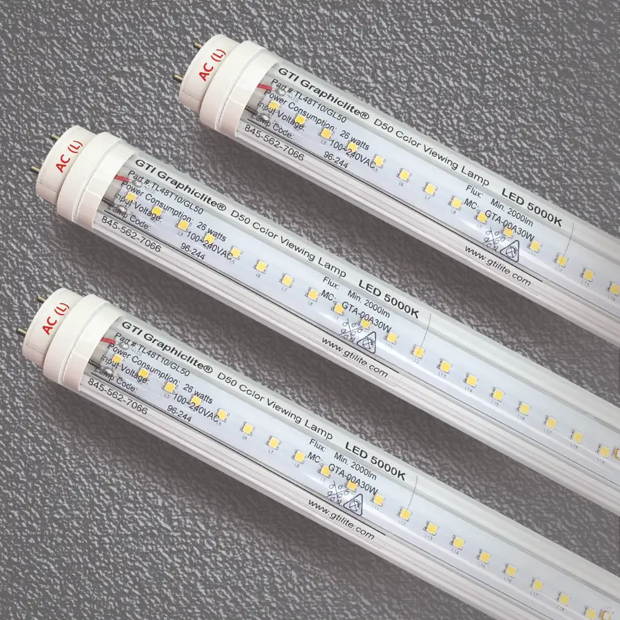
After managing hundreds of multi-factory kitting projects, I found the culprits destroying color integrity are always the same. Buyers choose the wrong Pantone library for their material. They ignore how different substrate chemistry absorbs ink. Worst of all, they approve a 10,000-unit run based on a backlit computer screen instead of demanding a physical proof evaluated under a standard D50 lightbox.
To protect your brand and prevent costly rework, you need a system. You must enforce the correct material reference, strict physical proofing, specific lighting discipline, and ongoing quality control directly on the factory floor.
We will cover the basics first, walk through the factory workflow, explore the business case, and outline the physical limits of production.
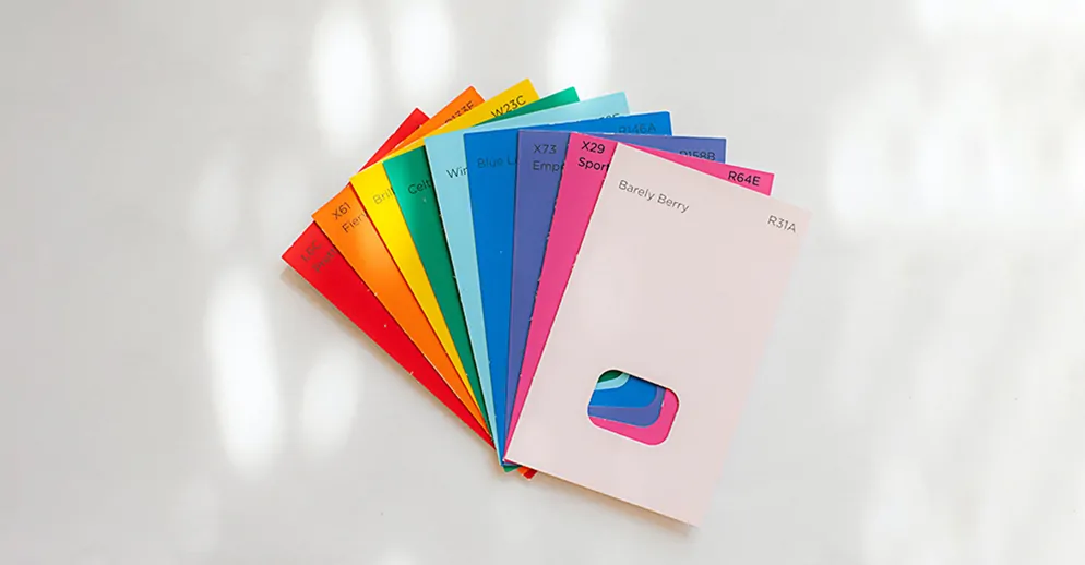
What is the Pantone Matching System?
The Pantone Matching System (PMS) is a standardized color reference system. Think of it like a universal recipe book for ink. A pantone matching system bulk order applies this standard across high-volume manufacturing. The challenge is repeating that exact color flawlessly over thousands of units and multiple base materials.
Before our team approves a production run, we align on these exact terms:
- Spot Color vs. CMYK: CMYK layers four inks for images. It is unreliable for logos. We strictly use Spot color (pre-mixed target ink) for brand-critical accuracy.
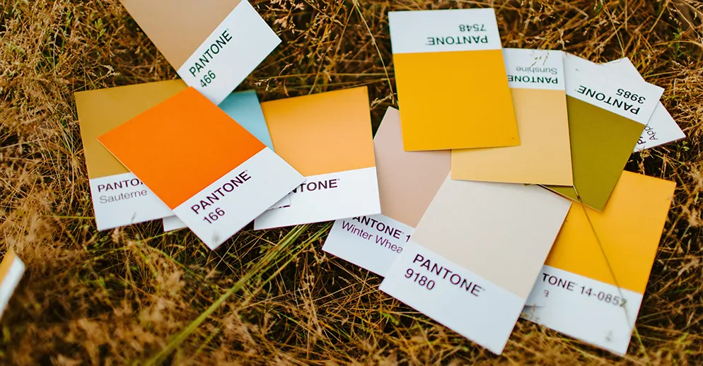
- Print Surfaces: We use Pantone Solid Coated or Uncoated guides for paper.
- Apparel: When sourcing types of clothing, we require the Fashion, Home + Interiors system (TCX or TPG).
- Plastics: We mandate Plastic reference chips for molded parts.
Matching bulk orders is harder than approving a single sample. Materials absorb dye differently. Dye sinks into a plush velour fabric differently than ink cures on a tumbler. Last quarter, a client tried matching a polycarbonate buckle using a cotton swatch. We stopped production.
A textile reference does not translate to plastic. During our Shenzhen audit, Manager Huang showed how using the correct plastic chip dropped the color rejection rate from 18% to zero. As the Pantone Color Institute notes, standards only work when you match the specific library to the physical substrate.
🌍 Real-World Context: Giving a factory a single Pantone code for both a cotton shirt and a metal pen guarantees a mismatched order. Always specify the material-appropriate library.
How Bulk Pantone Matching Actually Works? The Standard Operating Procedure
In my experience, color control fails when teams treat Pantone as a single universal answer. On the factory floor, the correct formula depends on the substrate, the printing process, and strict proofing discipline. We follow a rigid Standard Operating Procedure (SOP) to prevent mismatched bulk runs.
Step 1: Choose the Correct Reference by Material
You cannot use a paper color swatch to dye fabric. We divide production into three specific matching pathways.
- Paper & Packaging: We use Pantone Solid Coated or the supplier's exact offset print standard.
- Fabric & Textiles: For custom promotional clothing, we require a textile-specific Pantone reference (TCX). We then initiate a physical lab-dip workflow to test the dye.
- Molded Plastics: We use Pantone Plastic Standard chips. We route these through a licensed masterbatch process to color the raw resin.
Mixed-material kits compound this issue. A cotton shirt, a paper notebook, and a plastic bottle cap each require a unique chemical formulation to achieve one unified brand color.
Step 2: The Substrate Teardown
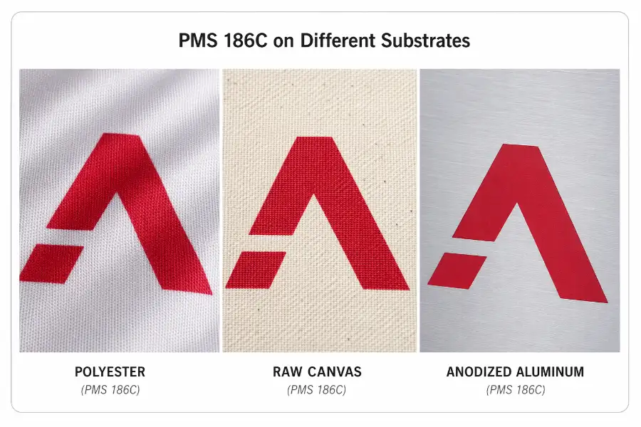
When we place these items side-by-side, they look completely different. Two physical variables cause this visual drift.
- Absorption: Canvas absorbs ink rapidly. This mutes the color saturation. Polyester resists ink, requiring a thick white underbase to push the color forward. Anodized aluminum reflects light because its surface is completely sealed.
- Lightfastness: A correct ink formula still drifts visually over time if the substrate reacts differently to UV exposure.
Gloss, surface texture, and underbase thickness further alter the final look. The same Pantone code never guarantees the same appearance across different substrates.
Step 3: Enforce the Physical Approval Chain
A digital e-proof is a major liability for any pantone matching system bulk order. Monitors vary. Pixels cannot replicate physical texture or ink absorption. Digital files speed up communication, but they must never replace physical sign-off.
We enforce this strict physical approval sequence.
- Receive the artwork file with exact Pantone callouts.
- Confirm the correct Pantone library for each component.
- Evaluate a physical fabric lab dip for dyed materials.
- Review a print strike-off test for logos and graphics.
- Check the plastic masterbatch sample for hard goods.
- Inspect the fully assembled pre-production sample.
- Lock in the approved Golden Sample as the primary production reference.
Step 4: The Leeline Physical Proof Protocol
A correct e-proof can still ruin a bulk run. To protect major promotional clothing marketing campaigns, our QC managers execute this physical proof protocol directly on the factory floor.
- Review the Golden Sample inside a viewing booth using ISO standard D65 daylight.
- Compare the item directly against the physical Pantone chip and the raw substrate.
- Confirm the print method, underbase thickness, and gloss level match the approved sample.
- Evaluate multiple kitted components together to verify the system reads as one brand.
- Record spectrophotometer readings before authorizing the bulk release.
- Store the Golden Sample safely to calibrate future regional reruns.
Step 5: Control Batch-to-Batch Variance
During a recent 50,000-unit tote bag audit, our Master Ink Mixer explained why colors drift mid-run. As solvents evaporate, ink viscosity shifts and darkens the print. Mesh wear, factory temperature fluctuations, and changing dryer settings all alter the final color. Even a new lot of raw fabric changes the baseline formula.
To combat this, the press technician pulls interval samples every two hours. They measure the color drift against the Golden Sample using a spectrophotometer. Following X-Rite's color measurement guidelines, the technician must recalibrate the press before the run drifts outside a Delta E < 2.0 tolerance limit. Keeping the run under a 2.0 tolerance ensures the human eye cannot detect the variance.
Step 6: The Buyer Playbook
To secure your brand colors across any factory floor, follow this concise checklist.
- Send the exact, material-specific Pantone code.
- Approve a physical lab dip, strike-off, or masterbatch sample.
- Sign off the final Golden Sample under D65 lighting.
- Lock a Delta E tolerance requirement into your PO.
- Inspect the goods mid-run, not just at the shipping dock.
The Executive ROI: Why Strict Color Control Matters?
For procurement and brand leaders, inconsistent bulk colors aren’t just visual errors—they’re costly revenue risks. Every rework, dispute, or failed shipment hits your bottom line.
This section breaks down the hard ROI of strict Pantone color control: protecting brand integrity, unifying multi-factory sourcing, and eliminating costly production surprises.
1. Secures Brand Integrity Across Global Campaigns
A pantone matching system bulk workflow prevents costly visual drift. Consistent color directly impacts revenue. According to Lucidpress, brand consistency increases revenue by up to 33%. In my experience auditing global rollouts, misaligned colors immediately trigger vendor disputes. We enforce strict color discipline so Creative Directors secure visuals across promotional clothing marketing and Procurement Officers eliminate rework.
2. Unifies Complex Multi-Factory Sourcing
Pantone provides one shared language across print, textile, and plastic suppliers. Because we bundle multi-item packages, we force diverse factories to hit the identical visual target. Last month, Manager Zhou at our Shenzhen facility adjusted his heat-press timing to match a plastic power bank to a custom promotional clothing order. He noted: "Without a shared Pantone target, kitted merchandise fails completely."
3. Eliminates Costly Bulk Run Surprises
Physical proofing and strict Delta E limits act as heavy-duty cost-prevention tools. On the factory floor, physical Golden Samples end debates immediately. I recently watched a client save $12,000 in Q2 by enforcing a Delta E tolerance under 2.0 before production began. X-Rite's color data confirms that measuring these physical limits prevents mid-run disasters.
What Sophisticated Buyers Ask Suppliers?
- Which exact Pantone family are you matching to?
- What is your maximum Delta E tolerance?
- Do you approve runs by e-proof or a physical Golden Sample?
- How do you manually control mid-run color drift?
📈 ROI Check: Measure your COPQ (Cost of Poor Quality). Track the exact dollar amount spent on replacement items when a factory misses your brand colors.
The Hidden Risks of Bulk Pantone Matching System Production
This section breaks down the three most common, costly pitfalls of bulk Pantone workflows, plus red flags to spot early so you can protect your brand, budget, and timeline.
1. Substrate Variance and Production Drift
Different materials absorb ink differently. A Pantone on coated paper looks muted on unbleached cotton. Long runs also suffer color drift. In our tests, viscosity changes and screen wear altered ink colors after 5,000 prints. As Floor Manager Wei noted during a recent audit: "Nighttime temperature drops thicken the ink. By morning, the color shifts two shades darker without recalibration." Environmental exposure also degrades lightfastness.
2. High MOQs and Multi-Factory Risks
Using a pantone matching system bulk approach requires high Minimum Order Quantities (MOQs) and adds weeks to production. Spot colors improve accuracy but cost more than standard CMYK printing. Splitting programs across multiple factories multiplies your risk. If one facility uses a different reference lighting standard, your kitted items will clash.
3. Chemical Compliance Constraints
Procurement teams must track dye safety. Heavy metals in custom inks cause failed border inspections. We run strict compliance checks, similar to plush toy label requirements, to verify chemical safety. The CPSC frequently rejects shipments for non-compliant custom colors.
- Approves production only via digital screens.
- Cannot name the specific Pantone family.
- Keeps no physical Golden Sample.
- Lists no exact Delta E tolerance limits.
- Skips mid-run QC checkpoints.
Final thoughts of Bulk Pantone Matching System Production
Ultimately, the Pantone matching system bulk workflow represents a strict operational defense. While differing substrate chemistries make absolute color uniformity physically impossible, enforcing the right SOP eliminates the risk of costly rework.
You must pair the correct color standard with the specific substrate, approve a physical Golden Sample, and inspect mid-run production under D65 lighting using Delta E-based QC. The Pantone number is merely your starting point; the physical proofing protocol is what actually protects your brand.
If you run isolated, small-batch prints on paper, this level of rigor is overkill. However, if you are scaling global campaigns across textiles, plastics, and metals, this framework is mandatory. If you need help building a bulletproof proofing workflow or sourcing mixed-material merchandise at scale, contact us today.
Editorial Integrity Statement
Our Pantone and QC guidance reflects authentic in-factory workflows. We operate fully independently, with no supplier payments, kickbacks, or brand sponsorships.
All processes are field-audited, data-backed, and tested across multi-factory production runs. Testing tools are self-purchased with zero external influence.
Digital proofs are for reference only; screen-based final color approval is prohibited. Realistic visual consistency is prioritized over unattainable perfect cross-material color uniformity for bulk orders.